%20(3).png)


Beginner's Guide to Understanding Histograms: Learn How to Nail Exposure in Your Photos
Assessing the exposure of your images while out shooting seems like a straight forward thing to get right, especially when you can preview how your photos look on your digital camera’s LCD immediately after taking them.
However, reviewing images on an LCD is not a reliable method for judging proper exposure in the field.
If you rely on your camera’s LCD to judge exposure, it is possible that you might under or overexpose and image without even knowing it.
You can even lose detail in an image that is impossible to recover in post-processing.
A highly useful tool called a histogram can help you achieve "correct" exposure in your photos by informing you how to adjust and optimize your exposure settings without relying on how your image looks on your camera's LCD screen.
Before we move on, it is important to note that "correct" or "proper" exposure is a subjective term.
Throughout this article, assume that a properly exposed photograph is one that looks close to what the photographer saw with her own eyes.
How are histograms used in photography?
In this article, you will learn how to use histograms to properly expose your photos and capture the most detail possible in your images.
If you got value from this article, please support my work by sharing it - or you can buy me a coffee.
I currently do NOT use affiliate links or receive compensation for products I recommend. I do this so my work stays honest and in line with my values. I only recommend gear that I personally use and believe is the best.
What is a Histogram?
A histogram is simply a bar graph used to visually describe information, or data.
Histograms are tools used by photographers, but the use of histograms is not limited to photography.
More specifically, a histogram graphically shows the frequency distribution of a set of continuous data.
Don't worry if you are not a math person. This concept is not as complicated as it sounds.
Here is a simplified example of how to use a histogram:
Let’s say we have a room full of 20 Labrador puppies.
We count how many are yellow, how many are chocolate, and how many are black.
Our data look like this: 5 yellow Labs, 8 chocolate labs, and 7 black labs.
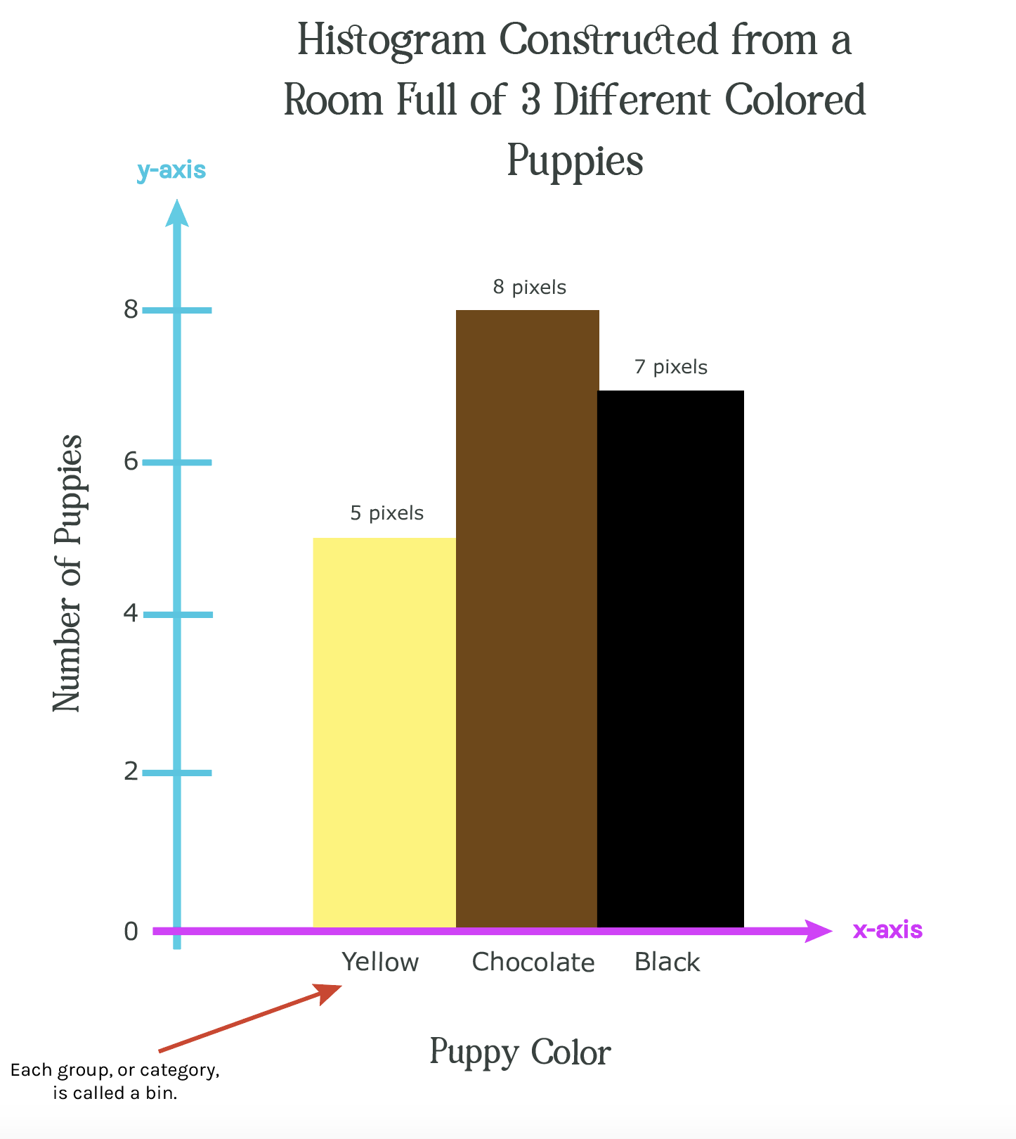
The graph shown in figure 1a is a histogram.
It displays:
- each category (i.e. the puppy group color) on horizontal axis (x-axis shown in pink)
- the frequency (i.e. the number of puppies) on the vertical axis (y-axis shown in blue).
Each group that we are tracking is called a bin.
A bin is really just a fancy word for category.
In this example, each bin is a different color puppy.
We have three different colors, or groups, of puppies, meaning there are 3 bins in this histogram.
Each bin is represented by one bar which shows us the frequency (i.e. number of), of puppies in that bin.
When plotted on a graph side by side, all of these bins produce a histogram that shows the frequency distribution of our puppies.
We can use this type of graph, or histogram, to plot all kinds of data where we have a continuous set of numbers and discrete bins (groups).
For example, we could graph the frequency of people’s ages in a movie theater by grouping people into bins representing different decades.
Or, as another example, we could graph the frequency of tree heights in a forest by grouping all of the trees into bins representing different height categories.
In the case of photography, as I’ll discuss next, the frequency of pixels in a digital image can be grouped by their level of brightness.
How Histograms Are Used For Digital Photography
Histograms used in photography graphically display the number of light and dark pixels in a photograph.
In other words,
a photographic histograms show the frequency distribution of pixel tones in a photograph.
Cameras and image processing software can construct histograms that show how bright or dark an image is based on the brightness of the pixels that make up the image.
Let me illustrate this with an example.
Imagine a photo that only 20 pixels and 3 different tones: black, grey, and white.
Note: this is an oversimplified example - most photos have thousands of pixels (when viewed on a computer) and hundreds of tonal values!
The histogram for this image is shown in figure 1b, below.
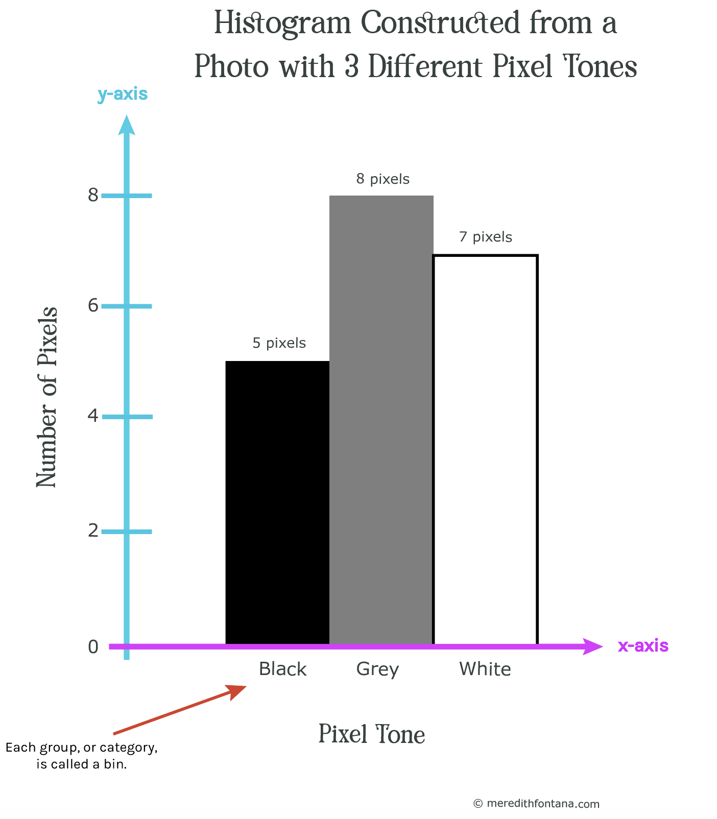
Notice that this histogram is almost identical to the one in figure 1a.
The only difference is that the three puppy colors have been replaced with three pixel tones to show you that both histograms work the same way.
So, How Do Photographers Use Histograms?
Histograms are a very useful tools that help photographers dial in proper exposure settings for their images in real time while out shooting photos.
There are 3 main times that photographers review image histograms to ensure their photographs are properly exposed
- In the field before the photograph is taken on a camera that has a live view LCD screen. This is typically found on most modern DSLR cameras.
- In the field after the photograph is taken using image review on a camera’s LCD screen.
- During post-processing (e.g. in Lightroom)
In order to view an image’s histogram in live view before you take the shot or in preview on your camera’s LCD, I recommend you refer to your camera’s manual or google search how to display a histogram on your cameras make and model in live view and image preview - assuming your camera has both of those features.
How to Read a Camera Histogram
Take a look at the histogram below in figure 2.
This histogram similar to what you would typically see on your camera’s LCD or in Lightroom when reviewing a photograph.
It works the exact same way as the histogram in figure 1b, except that there are 256 bins, or tones, instead of 3.
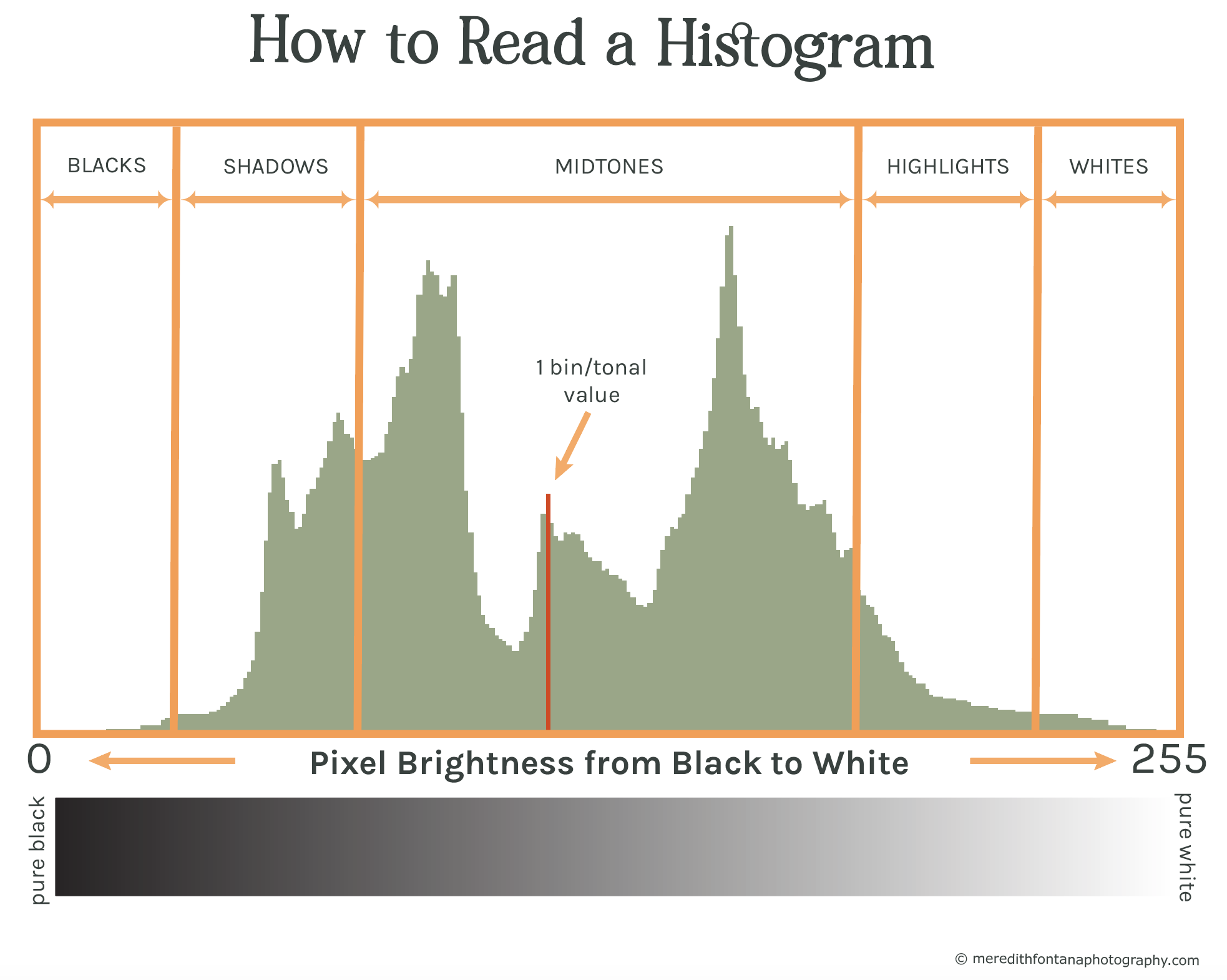
When your camera or computer reads an image, it assigns each pixel in that image a tonal value (i.e. brightness value).
Lower tonal values mean that the pixel is darker, and higher tonal values mean that the pixel is brighter.
Remember how a histogram is simply a bar graph?
There are actually 256 bars, or bins, on this graph, each one representing a tonal value from black to white.
All 256 bars are packed together side by side, which is why the graph looks like a curvy line.
The vertical axis shows the number of pixels there are for each tonal value.
As you can see from the horizontal axis, each bar on the histogram represents the number of pixels for a specific tonal value on a scale of 0 to 255, with the bars on the left representing the number of darker pixels, the the bars on the right representing the brighter pixels.
In figure 2, you will see a single red bar in the middle of the graph. This is shown to illustrate what a single bar looks like along the spectrum of all 256 bars.
This bar, or bin, represents a single tonal value, which, as you can see, is in the midtones. We can interpret that the pixels that this bar represents are grey in tone.
This bar also shows us how many pixels exist in the image for that particular tonal value, which you can see from how high it reaches up the vertical axis.
While we can’t see the exact number of pixels that exist at this tonal value, we can tell how many there are relative to the other tonal values, which is typically all the information we need.
If any part of the histogram touches the left side of the graph (i.e. there is a bar at tonal value 0), it means that the image contains pure black pixels and is equal to 0% brightness.
Alternatively, if any part of the histogram touches the right side of the graph (i.e. there is a bar at tonal value 255), it means that the image contains pixels that are pure white and equal to 100% brightness.
Collectively, all of the bars in the histogram are referred to the “tonal range,” which refers to the fact that it is describing the tonal information in an image.
Once you learn how to read histograms, you should be able to look at the shape of an image's histogram and determine which parts of the graph correlate to which parts of of your image.
The histogram in figure 2 shows us that most of the pixels in our image are in the midtones, as you can see from the concentration of pixels in the midtone range of the graph.
We would expect that the photograph that this histogram represents shows mostly medium bright pixels, with lesser amounts of pixels in the highlights and shadows.
If you are feeling a little confused, don’t worry!
In the next section we will explore this in more depth and I’ll show you plenty of examples to help you solidify your understanding of how to read and use histograms in order to get proper exposure in your images.
How to Interpret Different Histogram Shapes
The histogram that your images produce can tell you a lot about what is going on with the light in your scene.
Specifically, the distribution of peaks and curves in a histogram can tell you about the brightness and contrast in an image.
Learning to read and understand them is important if you want to understand exposure in your images.
Let’s look at an example using the histogram you have already seen in figure 2.
The image in figure 3 below is the image from which the histogram in figure 2 was produced.
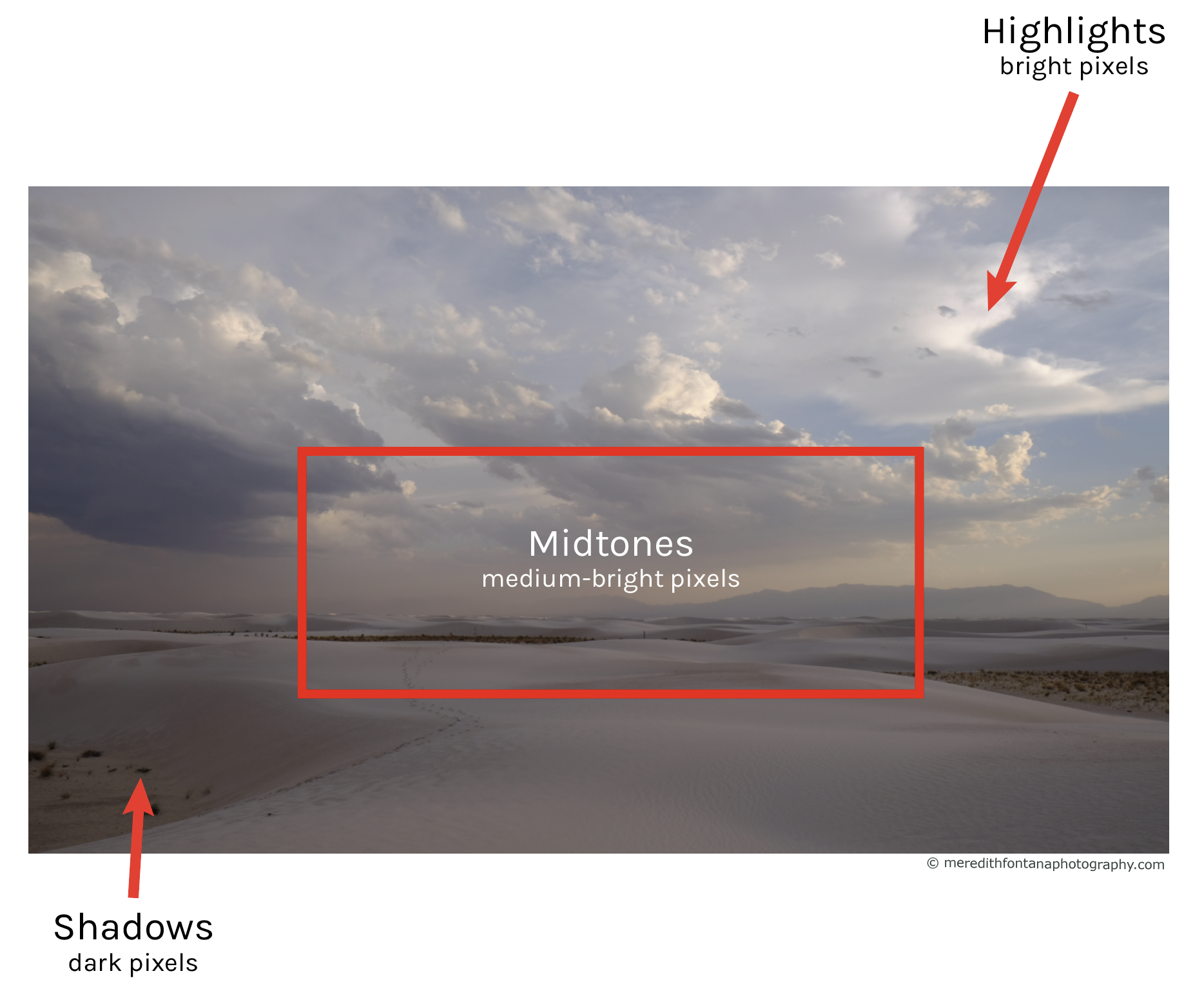
Remember how our expectation was that the photograph represented by the histogram in fig. 2 would have mostly medium bright pixels, with lesser amounts of pixels in the highlights and shadows?
This is indeed what we see from the image, as pointed out by the red arrows showing the light and dark regions, and the red box showing the region filled mostly with medium-bright pixels.
We know that none of the pixels in this image are neither pure black or pure white, because the histogram doesn't touch the left or right side of the graph.
Let’s now look at several different types of photographs and how their histograms correlate with the varying levels of brightness we see in them.
High-key images
A scene that is bright and has a majority of its tones in the highlights will show a spike in tonal values on the right side of the histogram. This can occur when shooting a scene in bright sunlight or a snowy landscape where there are a lot of bright pixels in the image.
In the example below showing a photograph of a mountain and its correlating histogram (figure 4) below it, you will see a giant spike on the right side of the graph, which represents all of the bright snow and sky in the image.
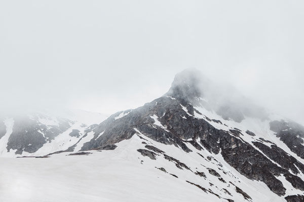
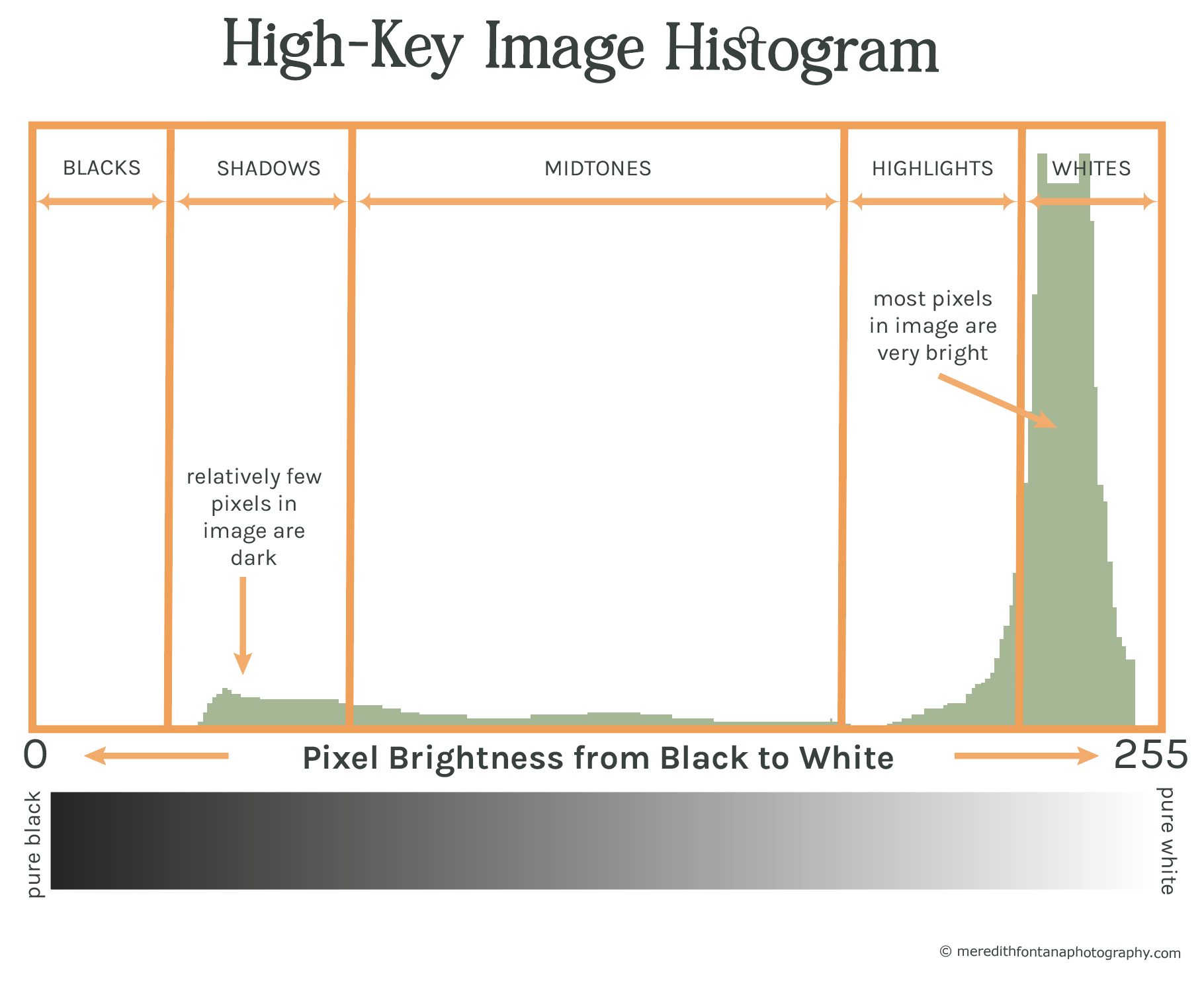
You will notice that the bars on the right rise much higher than what we can see on the histogram.
This doesn’t indicate that there is anything wrong with the histogram. It just means that the histogram isn’t tall enough to accommodate all of the bar heights in the small area that we usually have to view them on our cameras.
Imagine that these bars continue above the top of the shown histogram - you just can’t see them with the space available.
Low-key images
Low key images are simply the opposite of high-key images. This type of image is dark and shows most of the tones in the shadows. Therefore, you will see high values on the left side of the histogram where pixels with lower tonal values are predominant.
A photograph taken at night is a great example of a low-key image where most of the image is dark if not partly black.
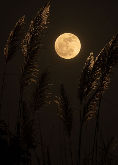
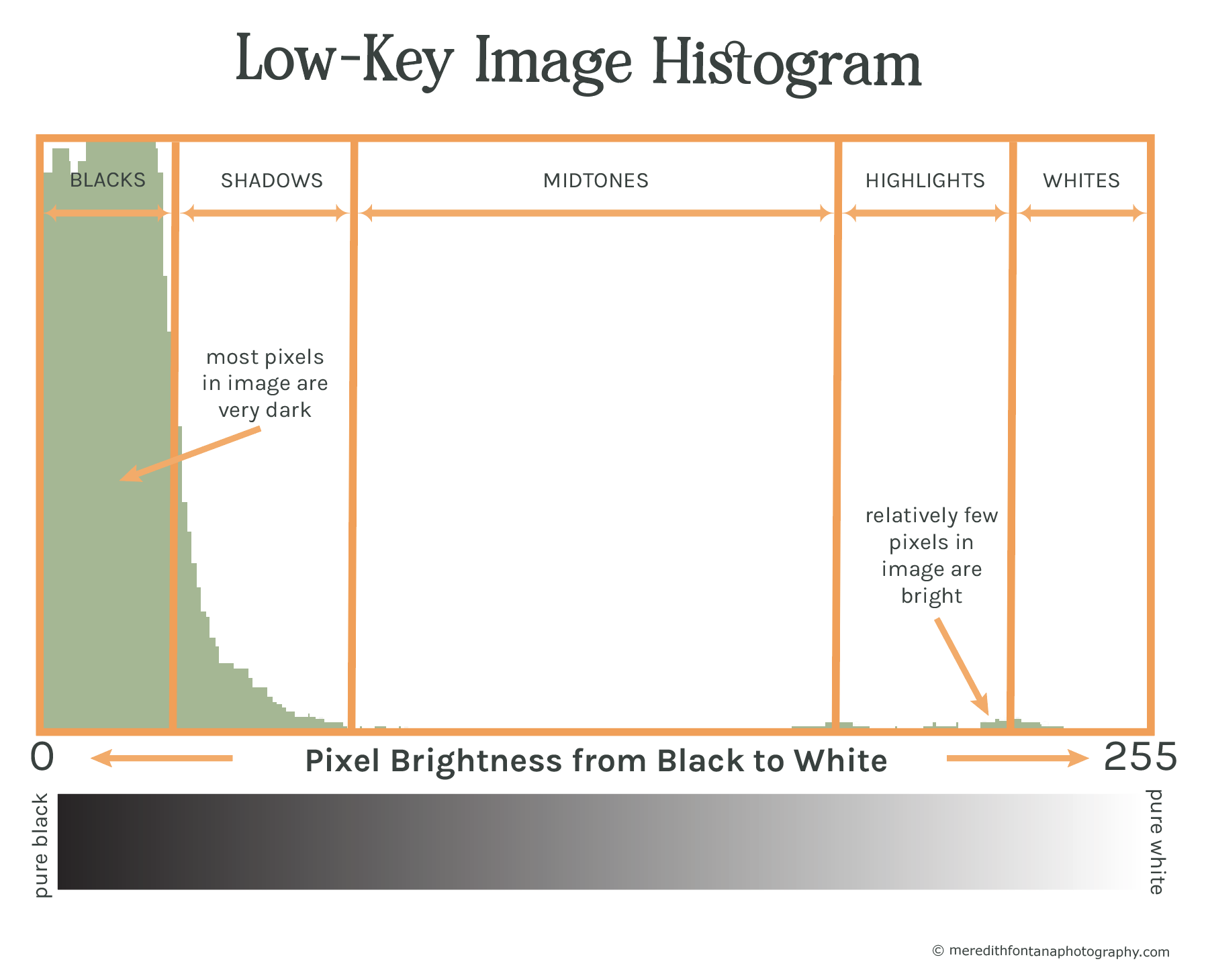
In the example above, you will see a high spike in pure black at the left side of the graph, seen in figure 5b. This represents the dark areas of the night sky surrounding the moon.
On the right side of the graph, we see a relatively small distribution of pixels in the highlights that approach pure white. This group of bars on the right side of the graph represent the different shades of the moon - the brighter pixels in the scene.
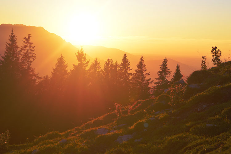
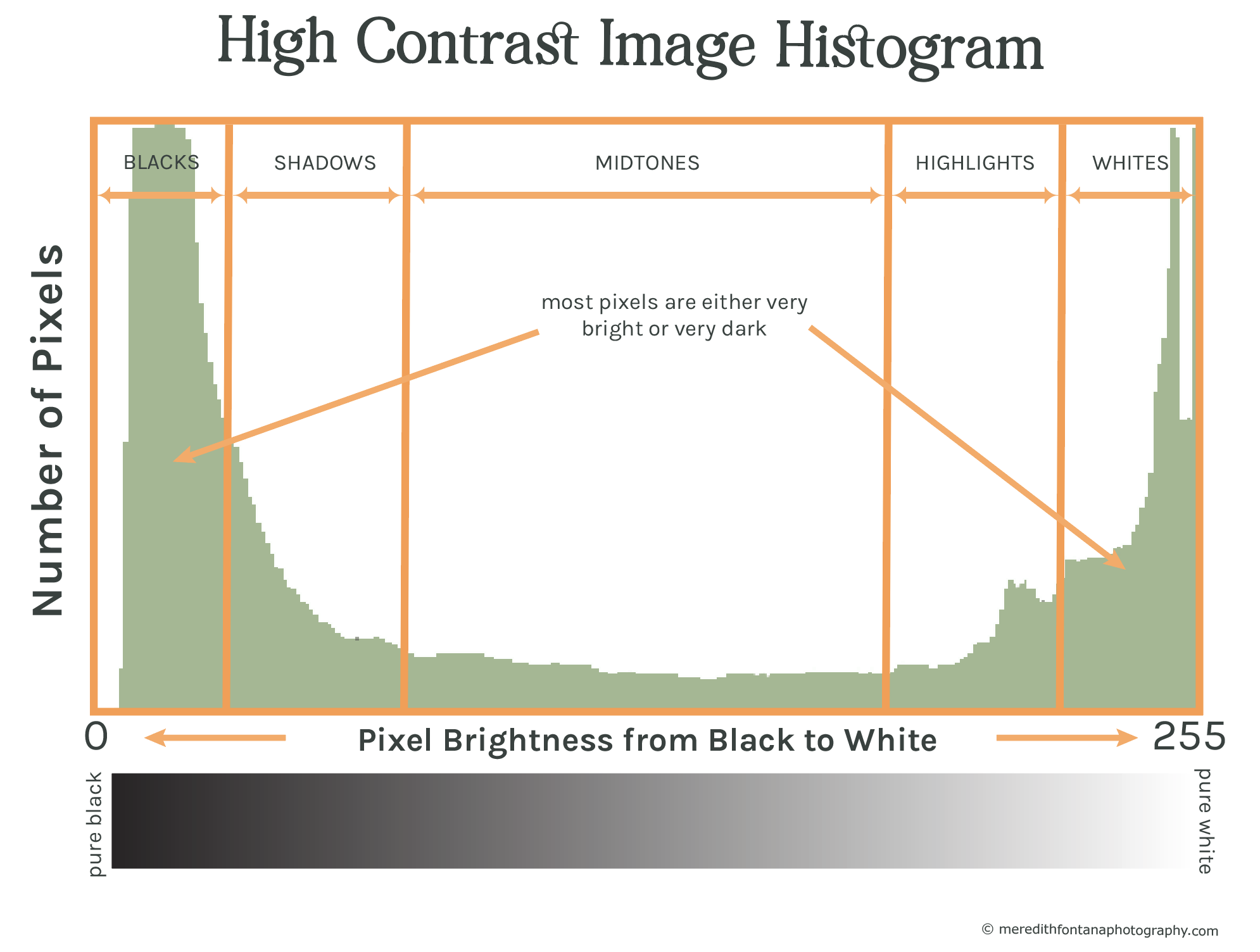
High contrast images
If you are photographing a scene that has both very bright and very dark regions, you will see a spike in both dark and light tones with much fewer tones in between.
This happens often in landscape photography when you are shooting into the sun, especially at sunrise and sunset.
This will generally display on the histogram as two peaks - on the left and on on the right - with a valley in between them.
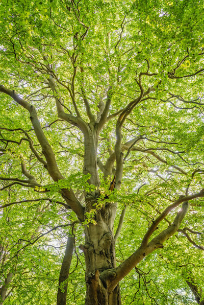
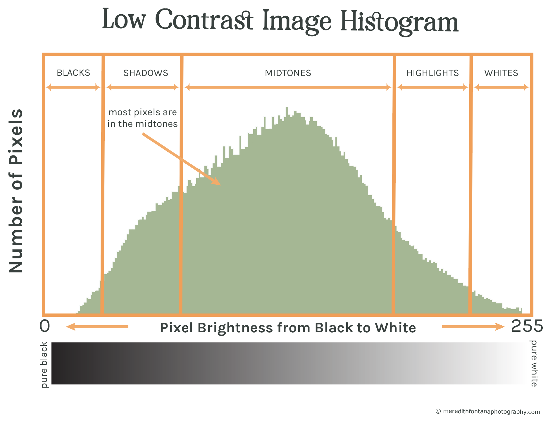
Low Contrast Images
Most of the tones in a low contrast image are in the midtones. An example of this is shown in figure 7a.
A low contrast histogram will produce a histogram that looks like a bell curve that peaks around the middle of the graph, as seen in figure 7b below.
Benefits to Using Histograms
While Live View and image preview is a very useful way to review the composition and focus of an image, your camera's LCD is not a reliable way to check the exposure of your images.
Say you’re out shooting and trying to capture a beautiful sunset.
You adjust your aperture, shutter speed, and ISO to set the correct exposure.
You then press the shutter button, capture that amazing sunset, and check the LCD on the back of your camera to review how your image looks.
The image exposure looks great! But…
When you get home and look at the image on your computer, you see that the photo is too bright.
This happens because, depending on the ambient light and the brightness of your camera’s LCD,
an image can render differently on your camera's LCD than what has actually been captured by your cameras sensor.
This problem is compounded by the fact that the image you see on your LCD is the JPEG version of the image, not the RAW image, so it doesn’t show you all of the tonal data captured in the image.
You can avoid this by using and understanding how to use your camera's histogram.
Histograms take the guesswork out of proper exposure so that you can accurately judge what is going on with the light and dark parts of your photographs before and after you shoot them.
So how do you use your camera's histogram to dial in "correct" exposure? You will learn that in the next section.
How to Use Histograms to Nail Exposure
Once you have a basic understanding of how to read histograms, it’s time to learn how to use them to properly expose your photographs.
The first thing you should note before moving on is that there is no right or wrong shape of a histogram.
The shape of an image’s histogram doesn’t necessarily mean the image is “good” or “bad.”
The shape is simply providing us with tonal and exposure information.
One of the most important things a histogram can tell you about an image is whether or not it is under or overexposed to the point that you have lost detail in your image.
If part of the histogram is touching either the left or right side of the graph, then you can infer that you have lost detail in your image due to under or overexposure.
Let’s dive further into how this works.
First you will learn how to identify overexposure and underexposure. Then you will learn how to fix it.
Identifying Overexposed Images
When reviewing your image’s histogram on your camera, the first thing I recommend you do is look at the right edge of the graph.
Recall how I discussed earlier that the horizontal axis of the graph represents pure black at the extreme left (bar 0) and pure white at the extreme right (bar 255).
If any part of the histogram is touching the right edge of the graph, it means that part of your image contains pure white pixels and has therefore lost detail that cannot be recovered in post-processing.
In other words, it has been blown out or “clipped,” as shown in the figure below.
Clipping is the term used to refer to the loss of detail that occurs when part of your image is pure black or pure white. It is typically something you want to avoid in order to get proper exposure in your photos. It is impossible to recover clipped highlights in post processing.
Another term for clipped is "blown out." If an image is blown out, it has been clipped.
This can happen easily when shooting into the the sun or a capturing a composition that has a very bright areas lit up by the sun.
Since you are trying to capture as much detail as possible in our photographs, this is often not good and something you wan’t to avoid unless it is part of your creative intention.
For example, if you are shooting into the sun, you will likely have parts of your image clipped where the sun is, and that’s okay assuming that’s the way you want your composition to look.
Let's look at the example in figure 7 below, which shows an overexposed image (fig. 7a) and its corresponding histogram (fig. 7b).
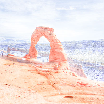
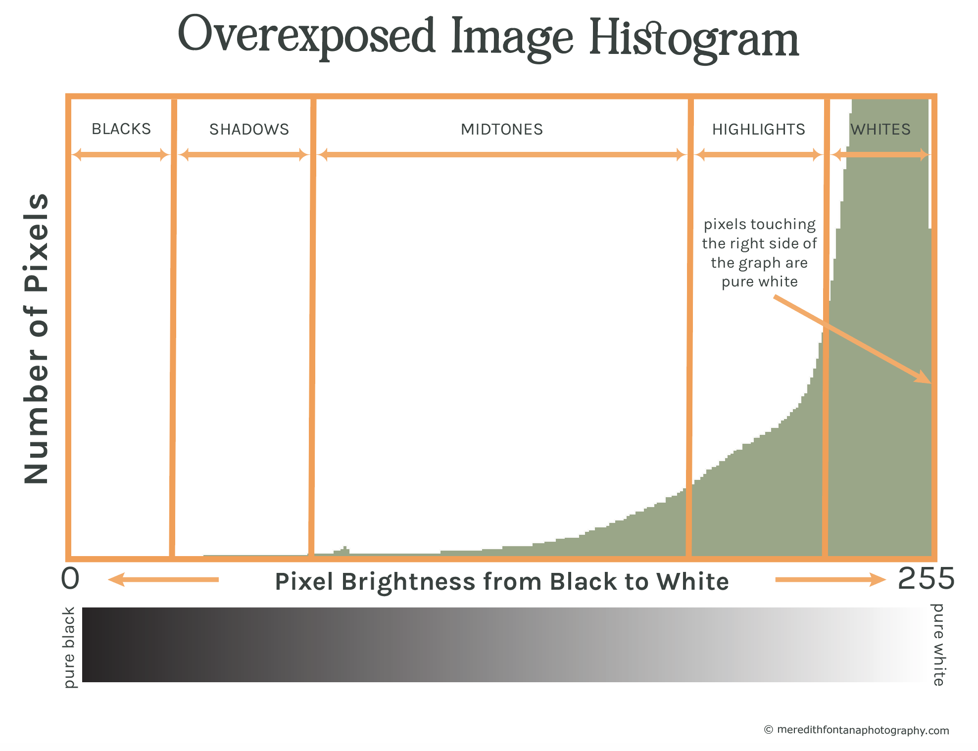
As you can see, the histogram correlating to this image is touching the right side of the graph. This clearly tells us that there are pure white pixels in the image and that the highlights are blown out.
I'll show you how to fix this in a minute, but let's discuss underexposure first.
Identifying Underexposed Images
Determining whether or not your image is too dark works the same way, except this time you want to check if the histogram is touching the left side of the graph, or pure black.
If you have pixels touching the left side of your histogram, it means you again have lost detail in the image and the dark regions (shadows) have been clipped.
Take a look at the example below, which shows an underexposed version of our image of Delicate Arch.
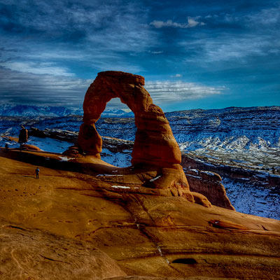
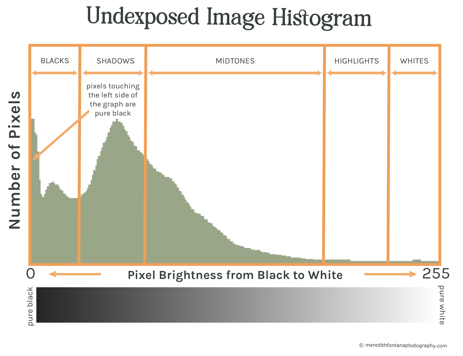
You can see in fig. 8b that the histogram is touching the left side of the graph and that pixels are piling up at bar 0, which represents pure black.
Some of the dark areas in the photo have been lost and cannot be recovered in post-processing.
In addition, if you try to lighten up the photo in post-processing (e.g. using Lightroom), noise will be introduced into the image which will degrade the quality of the photo.
How to Fix Clipping in Your Photos
You can easily adjust for clipping in the field by adjusting your camera’s exposure settings in two main ways:
- Adjust one of the elements of the exposure triangle (aperture (f-stop), shutter speed or ISO).
- Use your cameras exposure compensation.
For example, if your highlights are clipped (i.e. your histogram is touching the right side of the graph), lower your exposure by closing your aperture (lowering the f-stop value), reducing your shutter speed or lowering your ISO.
Alternately, you could darken your image by dialing negative exposure compensation using the “+/-“ button on your camera.
Below is a properly exposed version of our image of Delicate Arch and its corresponding histogram.
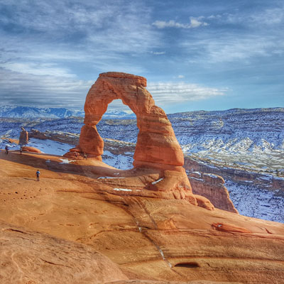
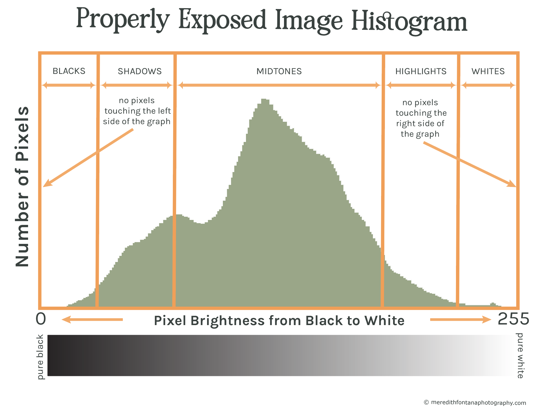
You will see in the histogram that neither the highlights nor the shadows have been clipped.
We can therefore infer that the photograph shown in figure 9a.has captured the most detail and light data compared to the images shown in figures 7a and 8a above where the some of the tonal data has been lost due to clipping.
The image of Delicate Arch in fig. 9a is likely the closest to what the photographer saw in real life with his own eyes at the time this photo was shot.
In other words, the photo in figure 9b is properly exposed.
Types of Histograms You Should Know About
It turns out that there are actually several different types of histograms that photographers use to measure tonal values and exposure in their images.
Don’t let this scare you, however, because they all work similarly to the ones used in the previous sections.
There are three types of histograms that photographers use and that you should know about:
Every pixel in a color image has a corresponding greyscale tonal value from 0 to 255 that represents how bright or dark that pixel is on a scale from black to white.
A luminosity histogram shows the number of pixels that exist for each greyscale tonal value in a photograph.
In other words, a luminosity histogram maps out the lightness (i.e. perceived brightness) distribution of the pixels in an image from black to white, which ultimately gives you a better idea about how much detail you captured in your image.
The histograms that you have seen in all of the previous examples/figures are luminosity histograms, so this type will already be very familiar to you.
As a review, figure 10 below illustrates what a luminosity histogram looks like.
The second type of histogram that you will at some point encounter either on your camera (usually only provided by higher end models) and/or in Lightroom is a color channel histogram.
They work similarly to the way luminosity histograms are constructed, but are slightly more complicated because that have to do with color rather than greyscale tonal values.
There are three color channel histograms: one for red, one for green, and one for blue. The reason you will see color histograms for red, green, and blue is because these are the primary colors of light.
These three colors can be combined in different amounts to make all other colors or light.
If you’re thinking back to 1st grade right now and confused because you thought that the primary colors are red, blue, and yellow, you are right.
What you might not know, however, is that the primary colors for light and the primary colors for pigments are different. If you are interested in the science behind this, you can learn more here.
Each pixel on your computer or LCD screen of your camera is composed of a combination of only red, green and blue light.
These three colors are combined together in varying amounts and intensities to produce the full spectrum of color you seen in an image.
For example, your eye perceives the combination of red and green light as yellow, and red, green, and blue light combine to make white.
Your camera assigns a tonal value (i.e. a brightness value) between 0 and 255 for each individual color in every pixel comprising a digital image.
This is how we get three separate color histograms, as shown in figure 11 below.
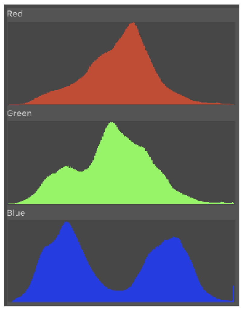
When a color is darker and less prominent, you will see more pixels for that color on the left side of the graph, and the brighter a color is, the more pixels you will see on the right.
Instead of assigning a tonal value for the overall brightness of each pixel and graphing it like you saw in in the luminosity histogram, this time we looking at the individual colors that make up each pixel and graphing their tonal values separately.
The reason that it is important to analyze red, green, and blue channels separately is because it is very possible to clip (lose data or image detail in) one of these color channel histograms even when your luminosity and/or RGB (see below) histograms look great.
For example, the red channel tends to blow out or get clipped much more easily than the other two colors, so even if the histogram you see on your camera shows that your image is properly exposed in the field, you might get home on the computer and see that part of your red histogram has been cut off on the right side of the graph.
Note: the histogram you see on your camera when viewing an image in the field is an RGB histogram, however, some high end cameras will show you the red, green, and blue color channel histograms in image preview. My camera, a Nikon D850, shows the color channels in image preview, so even if my RGB histogram looks good, I like to make sure that I haven’t clipped any of the color channels when reviewing my images in the field. This allows me to ensure that I haven’t lost any light data in the field.
Reviewing red, green, and blue channels separately is the most accurate way to determine whether or not you have under or overexposed an image, so always check them if they are available to you on your camera.
Its much easier to understand RGB (which stands for Red, Green, and Blue, of course!) histograms once you get how luminosity and individual color channel histograms work.
The RGB histogram is simply a single graph that combines the red, green, and blue channel histograms together to produce a single histogram.
Like I mentioned, it is possible to see a properly exposed RGB histogram but still blow out/clip one of the individual color channels, so be careful when using it to asses the exposure of your images in the field.
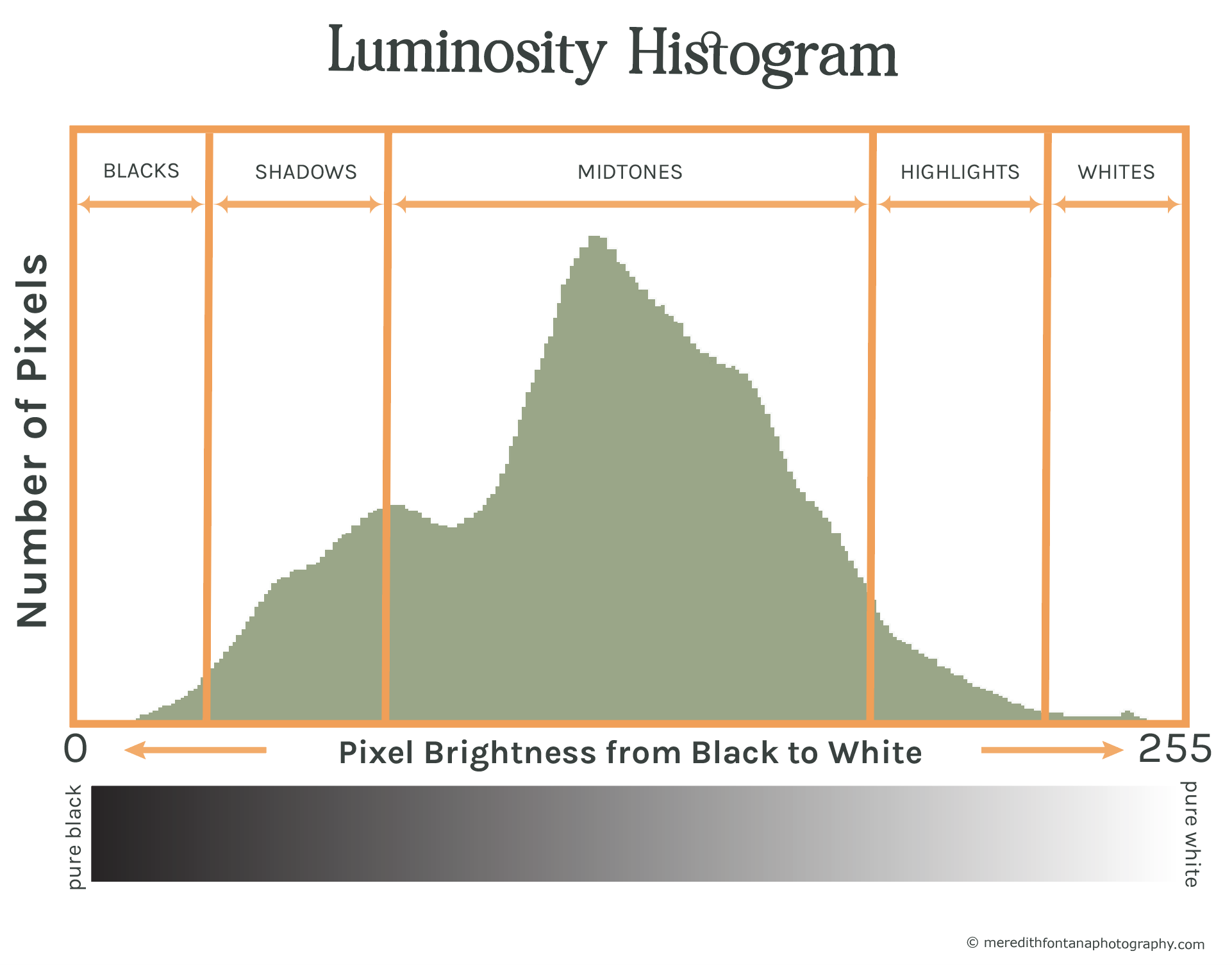
Take a look at the RGB histogram below in figure 12. This is the RGB histogram for the properly exposed image of Delicate Arch used in figure 9a.
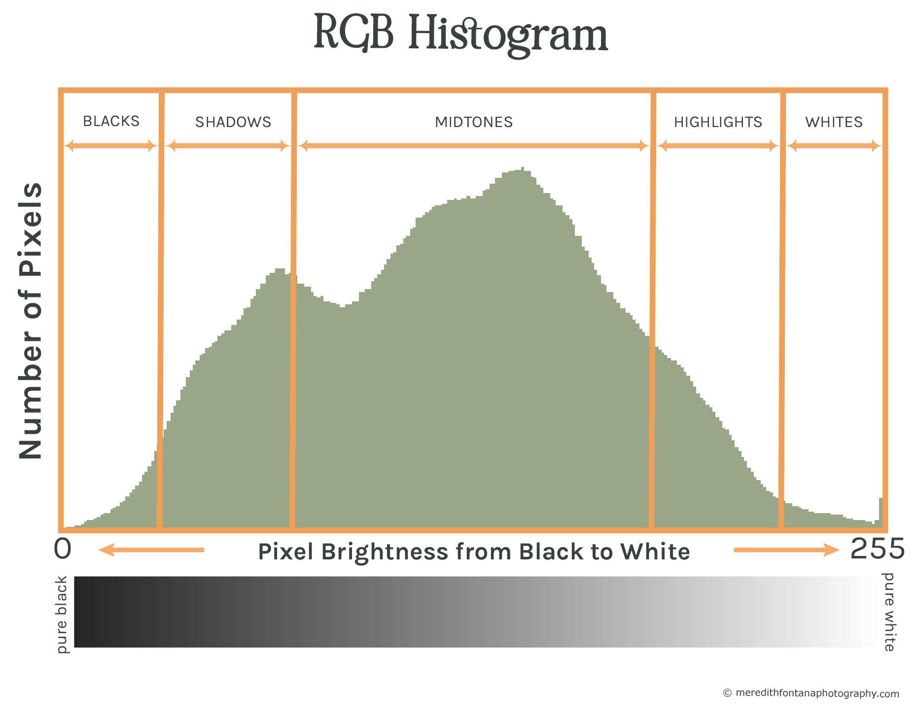
Notice how similar the RGB histogram is to the luminosity histogram in figure 10a. Remember, these were all constructed from the same image (in figure 9a).
A major difference, however, is that the RGB histogram is clipped on the right side.
If you look at the individual color channel histograms for this image above, you will notice that the blue channel has been blown out (i.e. it is clipped on the right side).
This is likely what is causing the RGB histogram (which incorporates data from all three color channels) to be clipped.
If the exposure of this image had been lowered a stop or so, the photographer could have captured more light data and avoided clipping the blue channel. Refer to the section "How to Fix Clipping" section above to see how to fix a clipped RGB histogram.
Summary
- A histogram is simply a bar graph used to visually describe information, or data.
- Histograms used in photography graphically display the distribution of light and dark pixels in a photograph.
- There are 256 bars on an image histogram. Each bar represents a single pixel tonal value (brightness level).
- Bars on the left side of the histogram represent dark tonal values and bars on the right side of the histogram represent light tonal values. Bars in the middle of the histogram represent the midtones.
- Histograms help photographers dial in proper exposure settings for their images in real time while out shooting photos.
- The distribution of peaks and curves in a histogram can tell you about the brightness and contrast in an image.
- The shape of an image’s histogram doesn’t necessarily mean the image is “good” or “bad.” The shape is simply providing us with tonal and exposure information.
- In most landscape photos where the photographer isn't shooting at night or into the sun, a histogram touching the right side of the histogram means the image is overexposed and the highlights have been clipped, and histogram touching the left side of the histogram means the image is underexposed and the shadows have been clipped.
- Clipping is the term used to refer to the loss of detail that occurs when part of your image is pure black or pure white. This can typically be fixed by adjusting your exposure settings.
- There are three types of histograms that photographers use and that you should know about: 1. Luminosity histograms 2. Specific color channel histograms for red, green, and blue 3. RGB histograms.